The fall semester is finally over and we have a 5 week break. I'm more used to the quarter system from UCLA and Stanford, but even so this semester seemed incredibly long. It's strange though because in engineering I'd always be mentally drained at the end of the term, but this time I was emotionally drained. I think it's this pressure to continually create things, and then to be immediately critiqued on it is very tiring.
But it was a great semester, highlighted of course by Color & Design. It was definitely a more technical quarter, with less full-fledged projects. But I felt I really learned a lot. Now I just need to rest up for the next semester!
Saturday, December 29, 2007
Final Sculptures

Here are the final sculptures I did in Figure Modeling. The left one is a reclining figure that we did in one 5 hour session. The horse was from our 'animal' homework. I think everyone was relieved not to have to work on figures, so everyone did a great job with their animals. :) The final 2 pictures are from a standing figure we did for our final exam. It was tough getting it done in 5 hours, but I think it turned out pretty well. Overall the class was a lot more fun than I expected. I'll still not become a sculptor though, just because it's so hard to store them. I was lugging home 3 sculptures and 15 pounds of clay when I made this realization.
Friday, December 28, 2007
Portrait: Final Version
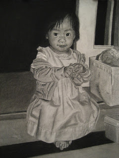 Here is the final version. The reason I chose this picture is so that I could try to draw a clothed figure, and the dress and sweater turned out pretty well, as well as the boxes and door. The issues I have are with the face. I spent probably half the time trying to get it to look like her. It's amazing how small the margin of error is on the face, especially on the eyes and the mouth. I could make a change of less than a millimeter on the mouth line and it would totally change the expression. So it was pretty much just making a change and seeing how it turned out, and repeating that over and over. I still don't think it really looks accurate, though it's close. Another problem was that the shading in the original picture is pretty flat, so it makes it more difficult.
It brings up the question of whether realistic drawing is relevant in light of photography. I'll probably get some flak for this, but I think realistic portraiture at least has lost it's place. It's just too hard to get it really accurate, when the camera can do it so quickly. It makes me wonder if the Mona Lisa or other famous portraits really look like the people they portray. :) However perhaps the portrait doesn't have to look exactly accurate as long as it is a good drawing and it has areas of interest. I think that this drawing has interest because of the clothing and the surrounding areas, so it was not a wasted effort.
Portrait
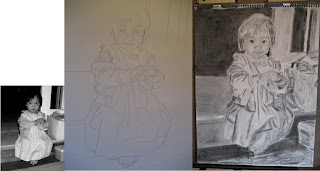
My sister had a really good photograph of my niece, and I decided to try to do a charcoal rendering from it. I'll have a lot more to say about how it turned out, but I thought people would be interested to see some of the intermediate steps.
The left image is the actual photo, and is 1/4 the size of the final 18"x24" drawing. I drew a grid on the photo and used that to transfer the outlines to the charcoal paper, as seen in the middle image. I try to keep the grid as light as possible so that I can erase it later. The outlines are done in charcoal pencil because vine charcoal can't withstand the blending of the next step.
On the right is the drawing with the initial values blocked in. This step is important because it sets the overall value pattern, and because it's hard to judge individual values when the paper is mostly blank. I spent quite a bit of time already on the face because that is the most important part. In some ways this drawing is better than the finished one. :) It has a better gesture, and even a better likeness. This unfortunately happens quite a bit, where in finishing the drawing you start to lose some edge control.
Monday, December 24, 2007
Mandala
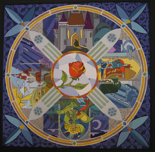
Our final project in Color & Design was a mandala. A mandala is a design featuring rotational symmetry, usually having spiritual connotations (i.e. the yin-yang symbol). Many of my classmates came up with beautiful abstract designs, but all of my designs were pretty representational.
The one I chose emulates a stained glass rosary. The 4 scenes are from the opening sequence of Beauty & the Beast. I've always loved those scenes, and this was a good chance to study them. The resulting design though was very complex, and took me forever to paint! I wasn't feeling too happy about it after I finished, but my teacher really liked it. I talked about it with a classmate and we think that there's always a bit of negative feeling after completion, because we are very aware of what didn't turn out as planned, and we are too conscious of small errors that people wouldn't normally notice. So as I get more emotionally detached from this work, I'm feeling better about it.
We were required to use an analogous split-complementary color scheme. So mine is predominantly blue, with the analogous range going from yellow-green to red-violet. My accent colors are red-orange and yellow-orange, which I've used for the rose, and the 2 rings. I've also used a little accent in each scene, and in the corner designs.
Tuesday, December 11, 2007
Figure Drawing

I haven't been posting pics from my figure drawing class, because I'm still really bad at it. However I have been making progress. It's strange though because it's very incremental, as opposed to other classes where the progress will be in big jumps. This class is more of a long struggle. It's also really random, where some drawings will turn out nice, while others will just be garbage. I think that inconsistency is because I'm still so new at it. I've collected 5 of the ones that turned out the best posted them above.
Tuesday, November 27, 2007
Color & Mood: Final
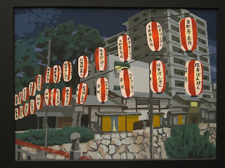
For the final painting, my teacher wanted me to do the lantern one, yikes! But this really is the stronger picture, and I might as well try it now when I can get her help. I'm finding that I agree with pretty much all her opinions.
It took me a horrendous amount of time, but I think it turned out pretty well. There's just a lot of things going on in the painting, and lots to think about. I managed to get things darker, and the lanterns stick out much better now. Also I tried to be less dependent on the posterization contours, and tried to approach it like a regular oil/acrylic type painting.
Color & Mood: Roughs
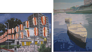
This is our next big project, Color & Mood. The cool thing about this project is that it is specialized for major. So the illustration majors had to do a drawing, the interior design people a room, the graphic design people an advertisement, etc. So everyone was really motivated because we were doing things in our major. I know that I was really interested in this, because this was what I came to art school to do - these types of paintings.
I chose two daytime photos I had taken in Japan this summer. The first is some lanterns in Matsumoto, and the second is some boat stones in a canal in Kyoto. The lantern scene was much more complex and took me about 12 hours. I tried to convert it to a night scene, with glowing lanterns. I think I didn't go dark enough though and it turned out more like late afternoon. :) The boat one took me about 5 hours. I tried to give the impression of a foggy morning, but this was also only marginally successful. Really fun though.
Tuesday, November 6, 2007
Cartoon
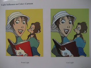 This was an insanely fun assignment. Actually the lecture was amazing also. It was about how light temperature affects color. In warm light, the warmer colors like red and orange get intensified, while cool colors like green and blue are de-intensified. And the opposite happens with cool colors.
In this assignment we were given a cartoon to color in with different light temperatures. We chose a set of local colors and modified them with orange and blue to show the how they look in different lighting. I probably accentuated the difference too much. But I love this cartoon, and painting it was incredibly fun. I wonder if I should become an animator. :)
Oops I Did It Again
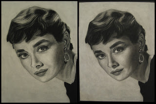 I was staring at my Audrey Hepburn portrait for the longest time because something didn't quite look right. I finally realized that it just needed to be darker! This surprised me because I was very conscious of making it dark, and the values matched the photos. But the darker version looks MUCH better. Actually I'm very happy with this now. I also make a few changes to the hair based on some comments by my coworkers. Thanks coworkers!
Note to self: I found out it's possible to work over an acrylic coating. However because the acrylic coating goes on in rather thick drops, it ends up making the texture very speckly. I think it's much better to use workable fixative until I'm totally sure it's done, then final coat with the acrylic.
Thursday, November 1, 2007
Sculptures
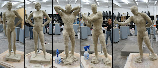
These are some projects we've been doing in sculpture class for the past month or so. The first two were 2 week projects on contraposto figures. This is an Italian term for the way the body parts like the hips, shoulders, and legs turn in different directions when the person is standing in a relaxed pose. In classical Greek and Roman art it was considered essential in achieving artistic beauty.
My first sculpture didn't turn out very well. It just feels kind of stiff. I think because I was thinking too much about the geometric figure we just finished. In the second piece I kind of went by instinct and it turned out much better. I'm finding that often it's better not to think too much about technique, because it can interfere with a good gesture. I didn't get as high a grade as I expected for either, but I'm also learning we shouldn't worry about grades.
The last 3 sculptures were our 'rapid studies', each done in about 45 minutes. This was really fun, because we didn't have to worry about refining everything and could work very loosely. I'm really happy with how these turned out. The model actually liked my last one and took a picture of it for his website. :)
Wednesday, October 31, 2007
Midterm: Portrait
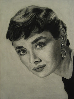
It's interesting that our midterm assignment for Figure Drawing was a portrait, since we did a portrait in Analysis of Form. I guess they expected us to learn something new before attempting this one. Anyways, it gave me a chance to do this Audrey Hepburn drawing that I was planning to do on my own. This drawing is not the equal of my Lauren Bacall, but the experience was interesting.
I used smooth drawing paper instead of charcoal paper to see what the difference is between the two. I found that the smooth paper smudges much more easily, and yet is not really that much better at blending. Perhaps it's because I left this as a more high-key drawing compared to the Bacall one. But also the drawing paper has kind of a pebbly look, versus the nice crosshatched look of the charcoal paper. This might be more a problem with my technique though since I've seen a really amazing portrait at school done on smooth paper. It was nice to try it, but I probably won't use it again.
This drawing also took much less time than the Lauren Bacall one. Where I spent about 25 hours on that one, this one took only about 12. For sure it is a simpler photo. But I find I am much more aggressive about putting in the values and in my pencil strokes in general. The hair in particular went amazingly fast. It only took about an hour, but I think it turned out very well.
Tuesday, October 30, 2007
Midterm: Color Portrait
 This assignment totally sucked the life out of me. I am walking around slower and am noticeably shorter. The assignment was to create a portrait using complementary colors + their mutes. I chose yellow-orange and blue-violet, which creates a very contrasty image. My troubles were mainly self-inflicted. I picked too complex of a photo - some of my friends used a much simpler portrait and still got very nice results. Also I might have been too ambitious with my color scheme. I used four ranges, one for the clothing, one for the hair/eyes, one for the face, and a small range for the background. The fact that the transparency cuts through 3 of the sections means 7 color ranges to mix, which was ridiculous. I also started way too late, and pretty much did all the painting in one day. I ended up around 2:30am and by then my mixed colors were starting to get way off. Also my transparency is too light. But I guess it's okay to go through these humbling experiences. In spite of many mistakes, it still looks alright, and my classmates and teacher liked it reasonably well.
Thursday, October 11, 2007
Hand and Foot
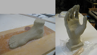 These are two homework assignments we had for figure modeling. On the foot, I totally procrastinated and just spent an hour on it and I got a really bad grade. On the hand I spent a lot more time and effort and it turned out much better. So maybe they are right that effort makes a much bigger difference than any innate talent.
 I'm actually liking this sculpture class, although I will never be a scupltor. It's the most physically demanding class though because we're standing for 5 hours, and it's especially hard when the clay has dried out a bit and it harder to push around.
Saturday, October 6, 2007
Analogous Color Portrait
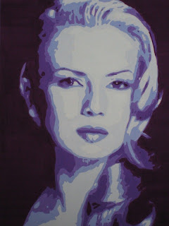
This was a very interesting assignment. We're starting to learn about color theory, in particular different color schemes. We were given a contour map of this portrait and told to fill in the areas with analogous color, meaning that the 6 colors used are adjacent to each other on the color wheel. Then we adjusted the values to match the sample by mixing in white and black. I chose the 6 colors from turquoise blue to violet. It took me a horrendously long time to finish this -- it basically turned out to be a big paint-by-number from hell. But I really like the result. It's doesn't look realistic, but by using analogous color and correct values it somehow feels harmonious. This is the key idea in the use of non-realistic color for expressionistic effect as pioneered (in Western art) by the post-Impressionists like Cezanne, Gauguin, and Van Gogh.
Tuesday, October 2, 2007
Color Wheel
 Another nutty assignment in Color & Design. Don't get me wrong - this is my favorite class. But the workload is crazy. We were supposed to paint about 50 swatches for this 24-step wheel, but I went a bit overboard and painted over 100! Then the cutting and assembly was pretty nervewracking, especially working with the Studio-tac adhesive. It's worth it though because this is pretty cool to look at. One interesting note is that we used a two-primary system, so a warm/cool red, warm/cool yellow, and warm/cool blue. This helps create the most vivid colors. Another reason I believe is that there is no pigment that precisely matches primary red, blue, and yellow.
Focal Point Design

Our next homework in Color & Design was to create a non-representational composition using ideas we learned about focal points, eye movement, etc. I really had a lot of trouble with this assignment, because this was really the first one where we were asked to come up with something on our own. Previously we pretty much just drew what we saw. Plus the fact that it is non-representational meant it needed to come straight from our imagination. I spent a lot of time trying to think of a design, and even a longer time drawing it in with all the different values. I actually stayed up until 4:30am the night before it was due. :) It reminded me of my days in the computer lab at Stanford!
In the end though I was pretty happy with my design. It's a gradually growing sequence of circles, triangles, and squares, following the golden section curve. Three diagonal lines from the upper left create interest and also lead the eye back to the focal point.
Thursday, September 27, 2007
Domo Arigato, Mr Roboto
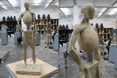 The third class I'm taking this semester is called Figure Modeling, colloquially known as "Naked People Sculpture". This project does not look like naked people. It doesn't even look like people. It's our "geometrical figure", and it's simplified forms allow us to study the shapes and proportions of various muscles in the body. To be honest, I'm not really into sculpture, but I can see how this class helps us with our figure drawing. I did get a pretty good grade on this figure though, and I'm a pretty fast sculptor for some reason. I guess all those years of playing with Play-Doh finally paid off!
We spent 3 weeks on this figure, so about 15 hours in all. Then immediately we had to tear it up and throw it back into the clay bucket, which was emotionally very traumatic!
Tuesday, September 18, 2007
Value Scale

I have an incredibly important class called Color & Design. It covers color theory, design concepts, and also presentation. It probably has the most workload of any class in the major, and is also really expensive. :) But I am really looking forward to it because the concepts are so crucial.
Our first assignment was to create a 9-step value scale. We first painted 25 shades of gray using gouache, then selected 7 shades between black and white such that each step is equally spaced! They are also very particular about the painting quality, and the mounting of the 'swatches' onto the cardstock. It's a bit dangerous because I can be very much of a perfectionist if provoked, and it seems like that is what they are asking. Maybe this is why so many artists are kind of crazy.
Figure Drawing 101
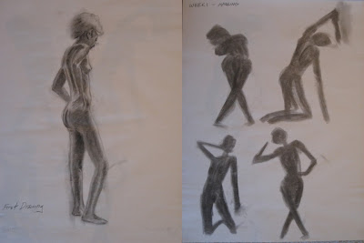
I've started my Naked People, errrr... Figure Drawing class. Our first assignment was to do a 40 minute drawing to use as a starting point to map out our progress. I think this was also a way to make us feel inadequate, at least for me because I'm really lousy at figure drawing. I've shown my drawing on the left.
Then we did a really awesome exercise called "massing". Using the side of the charcoal, we coarsely draw in the figure silhouette. It's a way for us to get a good "gesture" for the pose, and to loosen up and draw more confidently rather than concentrating on small details. This was incredibly fun - I could probably do massing all day.
Friday, August 31, 2007
Lauren Bacall - Modified!
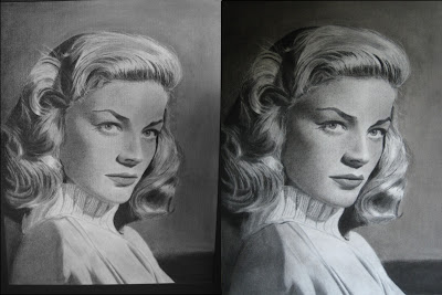
Against the wise counsel of some of my friends, I decided to modify my Lauren Bacall portrait. I was convinced it would look better if I darkened the face. It was a bit nerve-wracking, but I'm finished. Here's a before-and-after pic to prove that I didn't totally screw it up. It's not a huge difference, but I do think it looks better. The larger value range on the face creates more of a 3D look. Of course, darkening the face required darkening of the sweater and some other parts of the drawing. It's done now - I won't mess with this anymore!
Audrey Hepburn
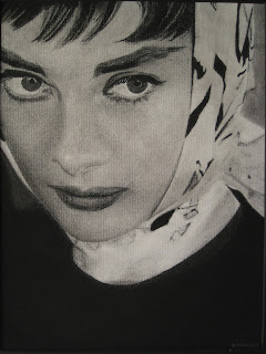
This is a small portrait (9"x12") I did while on vacation in Japan. It's kind of an unusual photo of Audrey Hepburn, but I needed something fairly simple. I wanted to prove to myself that I could draw dark, and I think it turned out pretty well. Yes it's kind of weird hanging out in the hotel room drawing, but it was really hot there and also I was waking up very early.
Monday, August 13, 2007
Summer Break!
I guess since I enrolled in the summer session, you can't really call it a summer break, but I have 4 weeks until school starts up again. Overall, Analysis of Form was a fantastic experience, even better than I expected. I was talking with one of my classmates and we were laughing about how just 7 1/2 weeks ago we were drawing ellipses, and poorly at that. It's amazing how fast the class progressed, and yet this is just the first small step of the program. I'm really happy with how my drawings turned out, and am looking forward to the next classes. Also my classmates and I agree that Jerry Boxley is an awesome teacher. He's perfect for this first drawing course. He talks alot, and is very detail-oriented: I remember the first day he told us how to sharpen our pencils. :) And he always has a positive comment about our work, and something that we can work on. And he can do that regardless of the student's level. It's really amazing.
Thursday, August 9, 2007
HW #3: Portrait
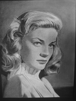
I have some misgivings about this assignment. With apples and drapery, your drawing can be a little off and people won't really notice, because it's not like we study apples and drapery. But somehow we are so keyed into the human face, and facial recognition, that we are very sensitive to things being even a little off. And it's not just the things that you would normally expect to make a face distinctive - like the eyes, or the mouth. But it's also little things like the curve of the jaw, the overall shape of the face, the distance between nose and chin.
So it's quite a challenge to try to draw a face, especially of a popular person. We used a grid system to help transfer the photo to the charcoal paper. My first impression was that this was kind of cheesy, but apparently it's a fairly accepted technique, especially when great accuracy is required. Our prof told us the masters used this technique to transfer sketches to the larger canvas.
I really love this photo of the young Lauren Bacall, so I was very motivated to make my drawing accurate. I think I spend about 5 hours just sketching out the face, and about 30 hours overall. I was really happy with how it turned out. But I seem to be falling into this pattern where I'll bring the drawing to class and mine will always be the lightest drawing. Somehow my classmates are much better at creating deep darks. It's getting to be very frustrating because I am very conscious of it as I am drawing. But it's like I have this mental block. They say it is common for beginning students not to go dark enough, so hopefully I'll overcome this eventually. Anyways my classmates and my prof seemed to like my drawing.
Thursday, August 2, 2007
Classroom
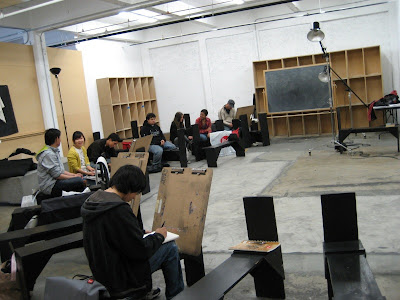
Here is a shot of our classroom. It's a bit crooked because I was trying to take it covertly. Those benches we use are more comfortable than they look, but still after 4-5 hours in them you can feel a bit sore. But they are surprisingly functional, allowing you to change the angle of your board, or spin it around as needed. My classmates look a bit sleepy because they are - our classes start at 8:30am, and we had a major homework assignment due today.
Monday, July 30, 2007
HW #2: Still-Life
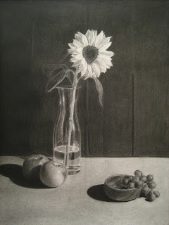
After a string of stinging defeats, I can finally claim one small victory over the charcoal. This still-life was our second big assignment. Our job was to create a focal point and a sense of depth. In my setup the sunflower is the focal point because it is highest on the page at the apex of a triangle formed by it, the apples, and the grapes. It is the brightest object, and also the most intricate. I actually don't have a lot of depth since the apples and the grapes are sort of at the same level. But the overlapping helps.
I was really happy with how the rendering turned out. Actually my favorite object is the foreground apple. I did that first, and it turned out really well and gave me confidence to finish the rest of the drawing. So that apple saved my life. And then I ate it. It's weird to stare at something for a week, then you eat it and poof it's gone.
I got two tips from a classmate, Joseph, that really helped. One was to use paper stumps for blending instead of my finger or Q-Tips. The other was to use charcoal pencils more for the darks, instead of trying to use the thicker Char-Kole sticks. For some reason I have trouble blending the Char-Kole with the willow charcoal, and also the pencils are much more accurate.
One thing I could work on is the darkest darks. I focused on pushing the darks, but when I saw my classmates work, they had REALLY dark darks. So that is something to work on. But still I am very happy with this. At the beginning of the class I would not have believe that I could draw something of this complexity.
Thursday, July 26, 2007
I See Naked People
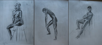
Analysis of Form is sort of a survey class, and this week we did figure drawing from live models. It was pretty stressful, not because of the unclothed people, but because I really suck at it. It doesn't help that I sit next to 2 of the best artists in the class and have to keep staring at their awesome drawings. Hopefully things will improve when I take Figure Drawing in the fall.
The models did 5 minute, 10 minute, and 20 minute poses. All the models are really good, both in the poses they come up with, and in their ability to hold them for a specific length of time. One of the guys was kind of lazy and kept doing sitting poses, sleeping poses, etc. :)
Monday, July 16, 2007
HW #1 - Drapery
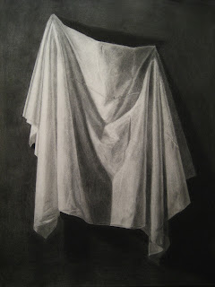
My first big homework assignment at the Academy of Art! We were supposed to spend 20-30 hours on this drapery, and I ended up spending a little over 20. I thought my hanging turned out very well, and it created a lot of nice folds and details that kept things interesting. The whole project went very smoothly, with no need to do any major changes. The blending turned out well, and I did this one entirely with Q-Tips. I still have the same bugaboo though of not having a big enough range of values across the drapery itself. I tried to go dark, but I was a little afraid to mix the compressed charcoal with the willow charcoal. I'll work on that in the next assignment. The background also is not very good, because I got a little sick the day before it was due, and only spent about 30 minutes on it. I feel happy about how the whole thing turned out though.
During break today we looked at the sketchbook of Ji, one of our classmates from China. His drapery didn't turn out super well, but his drawings are sensational. They are characters that he is designing just from his imagination. So I see that I still have a long ways to go, but if I can eventually create stuff like that I'll be happy.
Wednesday, July 11, 2007
Female Torso
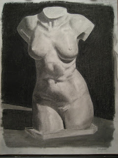
Another step up in complexity. Instead of straight lines we are dealing with a lot of curves. This was another 2 session work, so about 7 hours total. Yes it was difficult staring at a nude female torso for 7 hours, but these are the sacrifices I make for art! Haha. :)
I think my drawing skills are pretty decent, and I'm happy with the way the overall shape turned out. And in spite of how it looks, I'm feeling a lot better about my blending after getting a few tips from the girl who sits next to me, Cheon-Whee, who is probably the best blender in the class. Still having a big problem with the value range across the form. It's difficult because the torso is totally white, and my mind keeps telling me to keep it lighter than the background. But this causes it to look washed out.
Monday, July 2, 2007
It's Curtains for You All
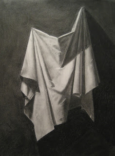
This was quite a step up in complexity from the simple objects we used before. But as Prof. Boxley pointed out, we use the same measuring skills we learned before. In this case we start with the points around the drapery (the top 2 pin locations, the furthest side points, and the bottoms of the longest folds), then connect them with lines. Then we choose a few internal points like the bottom of the big 'V' and connect those. It made things a lot easier to break it up like that. We spent quite a while on this 'drawing' phase - about 2 hours.
My blending is still a bit of a struggle, although it seemed to turn out okay in this piece. One thing though is that the range of values across the form is too small, so it looks sort of grayed out. Rendering took about 3-4 hours.
Thursday, June 28, 2007
Measuring Relativity
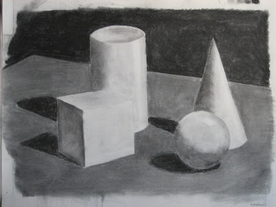
Our next lesson was about measurement. With a pencil held out at armlength, we use measurements to make sure the objects are the correct size relative to each other. Then we use angles and additional measurements to get the relative positions of each object. I think my drawing turned out pretty well. When my prof came by he said it looked like a blueprint because I had so many guidelines and measuring points going on. Maybe it's those engineering degrees.
But another thing I realized is that my blending sucks. :( This is the first time I am using charcoal, and it's a bit of a struggle, as much with the charcoal paper as with the charcoal itself. I just seem to have a lot of trouble blending it. Blending with my finger doesn't seem to do anything at all, but using the chamois basically takes off all the charcoal! I really need to work on it.
Monday, June 25, 2007
The Music of the Spheres
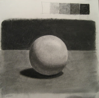
It all begins with spheres... I think because spheres are the simplest 3D objects. I suppose there are cylinders, but every art student knows how incredibly difficult it is to draw straight lines! This assignment is basically about shading, and we learned about the 5 value system as a simplification of the range of values. Here the background is 5 (the darkest value), while the foreground is a 3. A 4 value is used for the shadow on the sphere, blending to a 2 on the light side. The lightest value, 1, is used for the highlight.
I'll just be taking one class, Analysis of Form. I was actually a bit nervous going to school for the first day because it's been quite awhile, and I didn't know what to expect from art school. But I was pleasantly surprised. My classmates seem really nice, although basically they are young enough to be my children. And my prof Jerry is really energetic and funny.
Thursday, June 21, 2007
Off to Art School
I haven't been blogging alot, primarily because my Netflix queue has been full of episodes of the TV series '24' instead of movies. But also I have dropped down to part-time so that I could start taking classes at the Academy of Art in SF. I'll try to blog about my experiences there, and about the projects that we are working on.
Wednesday, March 21, 2007
Deep Impact

I'm not quite sure how Deep Impact ended up in my Netflix queue. I think because it's directed by Mimi Leder, who also did The Peacemaker which I really liked. Deep Impact is not a good movie though. It's about a comet that is about to strike the Earth, and has a very similar plot to Armageddon which surprisingly came out in the same year, 1998. I wonder what sparked these asteroid-extinction movies? Perhaps comet Shoemaker-Levy in 1994?
In any event, Armageddon, in spite of being a bit stylistically overdone, was a really good movie. Another extinction movie, The Day After Tomorrow, was also a good movie. So what went wrong with Deep Impact, which ostensibly has a more noble purpose, dealing more with the relationships reactions of the people before the impact? I think it's because there's just too many storylines going on, and not enough focus put on any one of them. Out of all the characters, perhaps we get to know the Tea Leoni one the best. But we hardly get to know the others, and so they end up rather one-dimensional. Armaggedon and The Day After Tomorrow were much more focused, and so emotionally they hit harder.
Deep Impact was kind of cool in the number of familiar actors that show up in the movie. It's like a bizarre trivia contest of semi-successful movie and TV stars, including Tea Leoni, Robert Duvall, Elijah Wood, Vanessa Redgrave, Ron Eldard, Leelee Sobieski, Dougray Scott, etc. Although it does have Morgan Freeman.
Subscribe to:
Comments (Atom)