The fall semester is finally over and we have a 5 week break. I'm more used to the quarter system from UCLA and Stanford, but even so this semester seemed incredibly long. It's strange though because in engineering I'd always be mentally drained at the end of the term, but this time I was emotionally drained. I think it's this pressure to continually create things, and then to be immediately critiqued on it is very tiring.
But it was a great semester, highlighted of course by Color & Design. It was definitely a more technical quarter, with less full-fledged projects. But I felt I really learned a lot. Now I just need to rest up for the next semester!
Saturday, December 29, 2007
Final Sculptures

Here are the final sculptures I did in Figure Modeling. The left one is a reclining figure that we did in one 5 hour session. The horse was from our 'animal' homework. I think everyone was relieved not to have to work on figures, so everyone did a great job with their animals. :) The final 2 pictures are from a standing figure we did for our final exam. It was tough getting it done in 5 hours, but I think it turned out pretty well. Overall the class was a lot more fun than I expected. I'll still not become a sculptor though, just because it's so hard to store them. I was lugging home 3 sculptures and 15 pounds of clay when I made this realization.
Friday, December 28, 2007
Portrait: Final Version
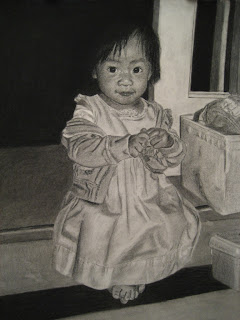
 Here is the final version. The reason I chose this picture is so that I could try to draw a clothed figure, and the dress and sweater turned out pretty well, as well as the boxes and door. The issues I have are with the face. I spent probably half the time trying to get it to look like her. It's amazing how small the margin of error is on the face, especially on the eyes and the mouth. I could make a change of less than a millimeter on the mouth line and it would totally change the expression. So it was pretty much just making a change and seeing how it turned out, and repeating that over and over. I still don't think it really looks accurate, though it's close. Another problem was that the shading in the original picture is pretty flat, so it makes it more difficult.
It brings up the question of whether realistic drawing is relevant in light of photography. I'll probably get some flak for this, but I think realistic portraiture at least has lost it's place. It's just too hard to get it really accurate, when the camera can do it so quickly. It makes me wonder if the Mona Lisa or other famous portraits really look like the people they portray. :) However perhaps the portrait doesn't have to look exactly accurate as long as it is a good drawing and it has areas of interest. I think that this drawing has interest because of the clothing and the surrounding areas, so it was not a wasted effort.
Portrait

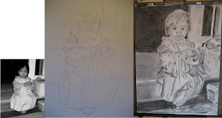
My sister had a really good photograph of my niece, and I decided to try to do a charcoal rendering from it. I'll have a lot more to say about how it turned out, but I thought people would be interested to see some of the intermediate steps.
The left image is the actual photo, and is 1/4 the size of the final 18"x24" drawing. I drew a grid on the photo and used that to transfer the outlines to the charcoal paper, as seen in the middle image. I try to keep the grid as light as possible so that I can erase it later. The outlines are done in charcoal pencil because vine charcoal can't withstand the blending of the next step.
On the right is the drawing with the initial values blocked in. This step is important because it sets the overall value pattern, and because it's hard to judge individual values when the paper is mostly blank. I spent quite a bit of time already on the face because that is the most important part. In some ways this drawing is better than the finished one. :) It has a better gesture, and even a better likeness. This unfortunately happens quite a bit, where in finishing the drawing you start to lose some edge control.
Monday, December 24, 2007
Mandala

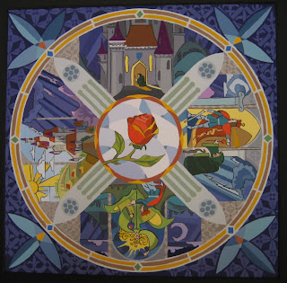
Our final project in Color & Design was a mandala. A mandala is a design featuring rotational symmetry, usually having spiritual connotations (i.e. the yin-yang symbol). Many of my classmates came up with beautiful abstract designs, but all of my designs were pretty representational.
The one I chose emulates a stained glass rosary. The 4 scenes are from the opening sequence of Beauty & the Beast. I've always loved those scenes, and this was a good chance to study them. The resulting design though was very complex, and took me forever to paint! I wasn't feeling too happy about it after I finished, but my teacher really liked it. I talked about it with a classmate and we think that there's always a bit of negative feeling after completion, because we are very aware of what didn't turn out as planned, and we are too conscious of small errors that people wouldn't normally notice. So as I get more emotionally detached from this work, I'm feeling better about it.
We were required to use an analogous split-complementary color scheme. So mine is predominantly blue, with the analogous range going from yellow-green to red-violet. My accent colors are red-orange and yellow-orange, which I've used for the rose, and the 2 rings. I've also used a little accent in each scene, and in the corner designs.
Tuesday, December 11, 2007
Figure Drawing

I haven't been posting pics from my figure drawing class, because I'm still really bad at it. However I have been making progress. It's strange though because it's very incremental, as opposed to other classes where the progress will be in big jumps. This class is more of a long struggle. It's also really random, where some drawings will turn out nice, while others will just be garbage. I think that inconsistency is because I'm still so new at it. I've collected 5 of the ones that turned out the best posted them above.
Subscribe to:
Posts (Atom)