Wednesday, October 31, 2007
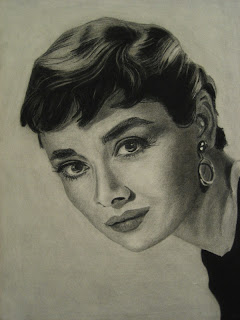
Midterm: Portrait
It's interesting that our midterm assignment for Figure Drawing was a portrait, since we did a portrait in Analysis of Form. I guess they expected us to learn something new before attempting this one. Anyways, it gave me a chance to do this Audrey Hepburn drawing that I was planning to do on my own. This drawing is not the equal of my Lauren Bacall, but the experience was interesting.
I used smooth drawing paper instead of charcoal paper to see what the difference is between the two. I found that the smooth paper smudges much more easily, and yet is not really that much better at blending. Perhaps it's because I left this as a more high-key drawing compared to the Bacall one. But also the drawing paper has kind of a pebbly look, versus the nice crosshatched look of the charcoal paper. This might be more a problem with my technique though since I've seen a really amazing portrait at school done on smooth paper. It was nice to try it, but I probably won't use it again.
This drawing also took much less time than the Lauren Bacall one. Where I spent about 25 hours on that one, this one took only about 12. For sure it is a simpler photo. But I find I am much more aggressive about putting in the values and in my pencil strokes in general. The hair in particular went amazingly fast. It only took about an hour, but I think it turned out very well.
Tuesday, October 30, 2007
Midterm: Color Portrait
This assignment totally sucked the life out of me. I am walking around slower and am noticeably shorter. The assignment was to create a portrait using complementary colors + their mutes. I chose yellow-orange and blue-violet, which creates a very contrasty image. My troubles were mainly self-inflicted. I picked too complex of a photo - some of my friends used a much simpler portrait and still got very nice results. Also I might have been too ambitious with my color scheme. I used four ranges, one for the clothing, one for the hair/eyes, one for the face, and a small range for the background. The fact that the transparency cuts through 3 of the sections means 7 color ranges to mix, which was ridiculous. I also started way too late, and pretty much did all the painting in one day. I ended up around 2:30am and by then my mixed colors were starting to get way off. Also my transparency is too light. But I guess it's okay to go through these humbling experiences. In spite of many mistakes, it still looks alright, and my classmates and teacher liked it reasonably well.
Thursday, October 11, 2007
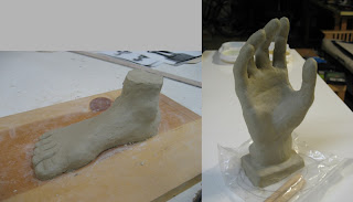
Hand and Foot
These are two homework assignments we had for figure modeling. On the foot, I totally procrastinated and just spent an hour on it and I got a really bad grade. On the hand I spent a lot more time and effort and it turned out much better. So maybe they are right that effort makes a much bigger difference than any innate talent.
I'm actually liking this sculpture class, although I will never be a scupltor. It's the most physically demanding class though because we're standing for 5 hours, and it's especially hard when the clay has dried out a bit and it harder to push around.
Saturday, October 6, 2007
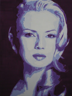
Analogous Color Portrait
This was a very interesting assignment. We're starting to learn about color theory, in particular different color schemes. We were given a contour map of this portrait and told to fill in the areas with analogous color, meaning that the 6 colors used are adjacent to each other on the color wheel. Then we adjusted the values to match the sample by mixing in white and black. I chose the 6 colors from turquoise blue to violet. It took me a horrendously long time to finish this -- it basically turned out to be a big paint-by-number from hell. But I really like the result. It's doesn't look realistic, but by using analogous color and correct values it somehow feels harmonious. This is the key idea in the use of non-realistic color for expressionistic effect as pioneered (in Western art) by the post-Impressionists like Cezanne, Gauguin, and Van Gogh.
Tuesday, October 2, 2007
Color Wheel
Another nutty assignment in Color & Design. Don't get me wrong - this is my favorite class. But the workload is crazy. We were supposed to paint about 50 swatches for this 24-step wheel, but I went a bit overboard and painted over 100! Then the cutting and assembly was pretty nervewracking, especially working with the Studio-tac adhesive. It's worth it though because this is pretty cool to look at. One interesting note is that we used a two-primary system, so a warm/cool red, warm/cool yellow, and warm/cool blue. This helps create the most vivid colors. Another reason I believe is that there is no pigment that precisely matches primary red, blue, and yellow.
Focal Point Design
Our next homework in Color & Design was to create a non-representational composition using ideas we learned about focal points, eye movement, etc. I really had a lot of trouble with this assignment, because this was really the first one where we were asked to come up with something on our own. Previously we pretty much just drew what we saw. Plus the fact that it is non-representational meant it needed to come straight from our imagination. I spent a lot of time trying to think of a design, and even a longer time drawing it in with all the different values. I actually stayed up until 4:30am the night before it was due. :) It reminded me of my days in the computer lab at Stanford!
In the end though I was pretty happy with my design. It's a gradually growing sequence of circles, triangles, and squares, following the golden section curve. Three diagonal lines from the upper left create interest and also lead the eye back to the focal point.
Subscribe to:
Posts (Atom)