Tuesday, November 27, 2007

Color & Mood: Final


For the final painting, my teacher wanted me to do the lantern one, yikes! But this really is the stronger picture, and I might as well try it now when I can get her help. I'm finding that I agree with pretty much all her opinions.

It took me a horrendous amount of time, but I think it turned out pretty well. There's just a lot of things going on in the painting, and lots to think about. I managed to get things darker, and the lanterns stick out much better now. Also I tried to be less dependent on the posterization contours, and tried to approach it like a regular oil/acrylic type painting.

Color & Mood: Roughs


This is our next big project, Color & Mood. The cool thing about this project is that it is specialized for major. So the illustration majors had to do a drawing, the interior design people a room, the graphic design people an advertisement, etc. So everyone was really motivated because we were doing things in our major. I know that I was really interested in this, because this was what I came to art school to do - these types of paintings.

I chose two daytime photos I had taken in Japan this summer. The first is some lanterns in Matsumoto, and the second is some boat stones in a canal in Kyoto. The lantern scene was much more complex and took me about 12 hours. I tried to convert it to a night scene, with glowing lanterns. I think I didn't go dark enough though and it turned out more like late afternoon. :) The boat one took me about 5 hours. I tried to give the impression of a foggy morning, but this was also only marginally successful. Really fun though.

Tuesday, November 6, 2007

Cartoon

This was an insanely fun assignment. Actually the lecture was amazing also. It was about how light temperature affects color. In warm light, the warmer colors like red and orange get intensified, while cool colors like green and blue are de-intensified. And the opposite happens with cool colors.

In this assignment we were given a cartoon to color in with different light temperatures. We chose a set of local colors and modified them with orange and blue to show the how they look in different lighting. I probably accentuated the difference too much. But I love this cartoon, and painting it was incredibly fun. I wonder if I should become an animator. :)

Oops I Did It Again

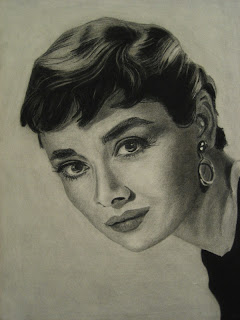
I was staring at my Audrey Hepburn portrait for the longest time because something didn't quite look right. I finally realized that it just needed to be darker! This surprised me because I was very conscious of making it dark, and the values matched the photos. But the darker version looks MUCH better. Actually I'm very happy with this now. I also make a few changes to the hair based on some comments by my coworkers. Thanks coworkers!

Note to self: I found out it's possible to work over an acrylic coating. However because the acrylic coating goes on in rather thick drops, it ends up making the texture very speckly. I think it's much better to use workable fixative until I'm totally sure it's done, then final coat with the acrylic.

Thursday, November 1, 2007

Sculptures


These are some projects we've been doing in sculpture class for the past month or so. The first two were 2 week projects on contraposto figures. This is an Italian term for the way the body parts like the hips, shoulders, and legs turn in different directions when the person is standing in a relaxed pose. In classical Greek and Roman art it was considered essential in achieving artistic beauty.

My first sculpture didn't turn out very well. It just feels kind of stiff. I think because I was thinking too much about the geometric figure we just finished. In the second piece I kind of went by instinct and it turned out much better. I'm finding that often it's better not to think too much about technique, because it can interfere with a good gesture. I didn't get as high a grade as I expected for either, but I'm also learning we shouldn't worry about grades.

The last 3 sculptures were our 'rapid studies', each done in about 45 minutes. This was really fun, because we didn't have to worry about refining everything and could work very loosely. I'm really happy with how these turned out. The model actually liked my last one and took a picture of it for his website. :)

Wednesday, October 31, 2007

Midterm: Portrait


It's interesting that our midterm assignment for Figure Drawing was a portrait, since we did a portrait in Analysis of Form. I guess they expected us to learn something new before attempting this one. Anyways, it gave me a chance to do this Audrey Hepburn drawing that I was planning to do on my own. This drawing is not the equal of my Lauren Bacall, but the experience was interesting.

I used smooth drawing paper instead of charcoal paper to see what the difference is between the two. I found that the smooth paper smudges much more easily, and yet is not really that much better at blending. Perhaps it's because I left this as a more high-key drawing compared to the Bacall one. But also the drawing paper has kind of a pebbly look, versus the nice crosshatched look of the charcoal paper. This might be more a problem with my technique though since I've seen a really amazing portrait at school done on smooth paper. It was nice to try it, but I probably won't use it again.

This drawing also took much less time than the Lauren Bacall one. Where I spent about 25 hours on that one, this one took only about 12. For sure it is a simpler photo. But I find I am much more aggressive about putting in the values and in my pencil strokes in general. The hair in particular went amazingly fast. It only took about an hour, but I think it turned out very well.

Tuesday, October 30, 2007

Midterm: Color Portrait

This assignment totally sucked the life out of me. I am walking around slower and am noticeably shorter. The assignment was to create a portrait using complementary colors + their mutes. I chose yellow-orange and blue-violet, which creates a very contrasty image. My troubles were mainly self-inflicted. I picked too complex of a photo - some of my friends used a much simpler portrait and still got very nice results. Also I might have been too ambitious with my color scheme. I used four ranges, one for the clothing, one for the hair/eyes, one for the face, and a small range for the background. The fact that the transparency cuts through 3 of the sections means 7 color ranges to mix, which was ridiculous. I also started way too late, and pretty much did all the painting in one day. I ended up around 2:30am and by then my mixed colors were starting to get way off. Also my transparency is too light. But I guess it's okay to go through these humbling experiences. In spite of many mistakes, it still looks alright, and my classmates and teacher liked it reasonably well.